Two Charts, One Story
When discussing the correlation between the sharp rise in Commodities Index (CCI) and the two QE programs by the Fed, I wrote:
When new money is “created out of thin air”, it quickly find its way, amongst other things, into the commodities and equities market as hot speculative money.This explains why, despite high unemployment and a struggling economy, the S&P managed to hit the 1,300 mark this week.
Here’s another chart showing performance of a narrower selection of 30 US stocks – the Dow Jones Industrial Average over the duration of QE1 and current on-going QE2. Correlation? – YES! Causation? You decide.
These 2 recently published charts from ZeroHedge further illustrate the point. They clearly show how closely the CRB index (another index tracking commodities futures market similar to the CCI) and the S&P 500 index correlate positively with the growth in the Fed’s balance sheet.
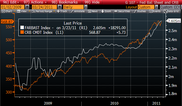
Commodity prices and the Fed's balance sheet. Chart from ZeroHedge
-
The “causation” factor is now so obvious. Newly created “Zero Cost Money” flows through the Wall Street banks working hand in glove with the PPT to prop up the stock market, giving an illusion of economic growth while pushing up prices of commodities. End result - the Wall Street elites enjoy the cream of the asset inflation cake while passing the effects of inflation in daily essentials to the Main Street.
-



 More Charts: 1-Month, 1-Year, 5-Year, 10-Year
 More Charts: 1-Month, 1-Year, 5-Year, 10-Year